
Ranking the ugliest kits in world football history
For a sport often described as the “beautiful game,” football has certainly seen an abundance of ugly uniforms over the years. Goalkeeper tops alone have featured some truly hideous designs, but the men between the sticks have mercifully been excluded from this list. Those with weak stomachs should proceed with caution as we rank the ugliest kits in world football history.
10. United States, 1994
Tomorrow we have the pleasure of speaking with icon of the 90s Alexi Lalas. Any questions for the former USA defender? #USA94 #Keepit90s pic.twitter.com/U7GP1DT1sP
— The 90s Football Podcast (@AK90s) June 29, 2017
Teams at the 1994 World Cup apparently loved experimenting with early versions of Adobe Photoshop to design some truly hideous uniforms. Look no further than the hosts, as the United States marched onto the pitch sporting absurdly large stars emblazoned on faux-denim tops.
Ugliness scale: ? (out of five)
9. 1860 Munich, 2010
No this travesty is not from the 1970’s! It’s actually a 150th anniversary shirt from 1860 Munich in just 2010! I don’t think it gets much worse. You could get away with it in 1970, not so much now ? Although if your mates were taking the biscuit a bit TOO much, it’s reversable! pic.twitter.com/WyoVBYfiCD
— RD ? Polls ? (@MUFC101_) May 25, 2018
1860 Munich’s attempt to honor the club’s most iconic moments on a 150th-anniversary shirt spawned a complete mess. Luckily, supporters had the option to reverse the top – to reveal another grisly sight.
Ugliness scale: ? ?
8. Hull City, 1992-93
Shit Kits! Hull City’s home kit from 1992/93. pic.twitter.com/xvWU1JeyY1
— 90s Football (@90sfootball) April 25, 2015
The orange and black stripes weren’t enough. Hull City took their nickname to the next level with a kit straight from the wardrobe of “Tiger King” villainess Carole Baskin. Unfortunately, the look didn’t seem to strike fear into opponents, as Hull finished the season sitting 20th in the old Second Division.
Ugliness scale: ? ? ?
7. Liverpool, 2013-14
do we plan to beat the home team by amusing them? RT @lfc: Liverpool’s brand new third kit for 2013-14 #RiseUpLFC pic.twitter.com/94smk0PTFh
— Adrian Wee (@weelikeme) July 4, 2013
Other than the badge, nothing about this third kit from the 2013-14 campaign gave the impression that it had anything to do with Liverpool. It’s not unusual for teams to experiment with unconventional designs for their third kits, but this one missed the mark by a mile.
Ugliness scale: ? ? ?
6. Chelsea, 1994-96
Chelsea away 1994-96 pic.twitter.com/IBtyW3OV3m
— ?? (@AFCMax9) April 10, 2020
Not even Dutch legend Ruud Gullit could pull this one off. Chelsea’s kit designer seemingly mashed several designs together to produce this sight for sore eyes.
Ugliness scale: ? ? ?
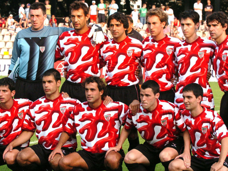
5. Athletic Bilbao, 2004-05
Athletic Bilbao 2004/05 pic.twitter.com/1JeJNOVh8r
— The League Magazine (@Theleaguemag) July 9, 2014
If Athletic Bilbao’s aim was to make their players look like they’d just visited a slaughterhouse, they nailed it with this blood-spatter ensemble to mark the club’s 100-year anniversary.
Ugliness scale: ? ? ? ?
4. Coventry City, 1992-93
Who remembers Coventry’s shocking red and white away kit, worn during the 1992/93 season? pic.twitter.com/21qnCdk7k7
— 90s Football (@90sfootball) October 7, 2014
Hungry opponents were doomed when they went up against Coventry City almost 30 years ago when the club donned a top that appeared to pay homage to deli meats.
Ugliness scale: ? ? ? ?
3. Reggina, 2011-12
This, worn by Reggina in 2012, is one football kit that I can’t believe ever existed. pic.twitter.com/knpsTULg6P
— Ashwin Raman (@AshwinRaman_) December 5, 2018
Reggina offered a solution for those struggling with body-image issues when they unveiled this gem of a uniform. Instead of going to the gym, fans of the Italian third-division club merely had to buy one of these naked-torso tops to instantly look jacked.
Ugliness scale: ? ? ? ?
2. CD Palencia, 2016-17
Meet Spanish soccer team CD Palencia pic.twitter.com/o63jKv3zQd
— Josh Elias (@thejelias) October 29, 2019
CD Palencia went with the “inside out” look and, well, it was pretty much one of the most unsettling uniforms ever created. Though predators with a taste for human flesh might find it appealing, it’s hard to imagine why anyone would green-light this hot mess of a design instead of laughing in the face of its architect.
Ugliness scale: ? ? ? ? ?
1. Colorado Caribous, 1978
Colorado Caribous, hands down. It makes Chapulín Campos’s goalie jersey looks like Netherlands ’88 jersey. pic.twitter.com/3aqKCgg1rQ
— Juan Pablo Romero ?? (@Juanpa19823) July 17, 2019
As far as ugly football shirts go, the Colorado Caribous’ kit is the Holy Grail. The club folded after one season, but the horrors of its uniform will live on forever thanks to its hideous color scheme, ridiculously large collar, and – the mother of all eyesores – beige tassels.
Ugliness scale: ? ? ? ? ?