NFL teams can begin reopening their facilities next week, although coaches and non-rehabbing players still will not be permitted, according to a memo obtained by ESPN on Friday.
In the memo sent to the 32 NFL teams, commissioner Roger Goodell wrote that clubs could begin using their facilities starting Tuesday, provided they meet a preestablished set of protocols and have permission under state and local regulations. Teams that are not ready or permitted to open by then can do so as soon as they meet the necessary criteria.
The first group of employees allowed back into facilities would include no more than 50% of non-player staff, up to a total of 75 per day. The only players permitted to return would be those who were already rehabilitating injuries prior to the facility closures, and no members of the coaching staff are allowed in the facility. Strength and conditioning coaches participating in player rehab may continue that work in the facility but otherwise are barred until the rest of the coaching staff is allowed to return.
“If you look good, you play good.” – Deion Sanders
theScore is counting down the 100 best uniforms in sports history, with a new post every weekday until May 15.
100-91 | 90-81 | 80-71 | 70-61 | 60-51
50-41 | 40-31 | 30-21 | 20-11 | 10-1
10. Croatia (current)
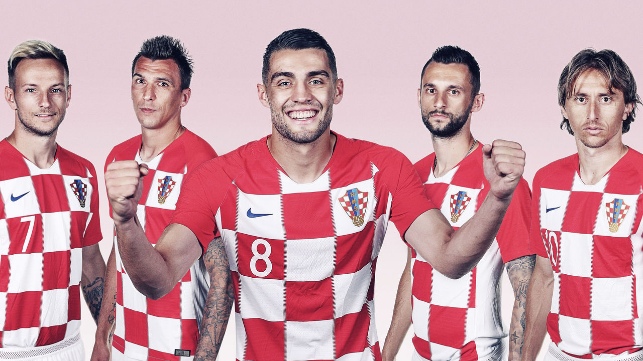
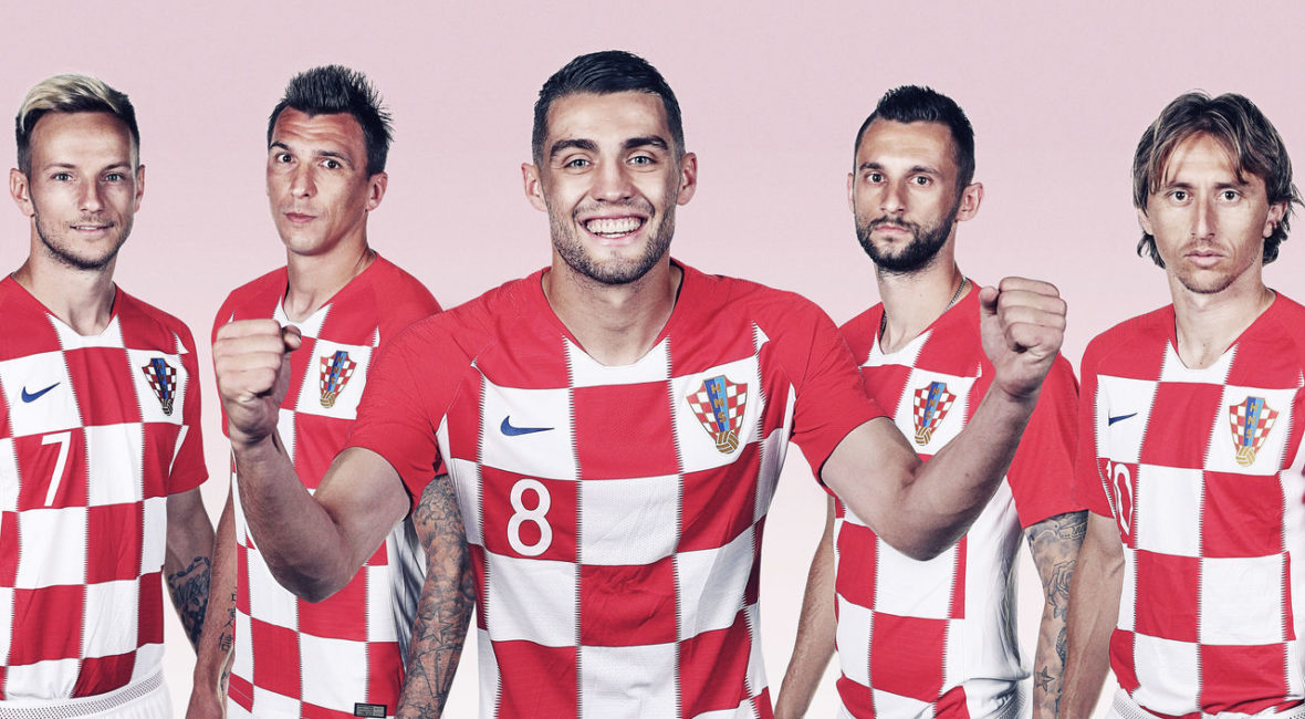
We kick off our top 10 with a uniform that, for many, will be a surprising inclusion. There is a wealth of unique and timeless kits among international soccer teams, but Croatia’s distinctive look stands above all others. The red and white checkered pattern has been compared to a chessboard, a tablecloth, and even the Purina pet food logo. However, the motif is actually based on the country’s coat of arms, a tremendous source of pride for Croatians.
9. San Diego Chargers (1960s)
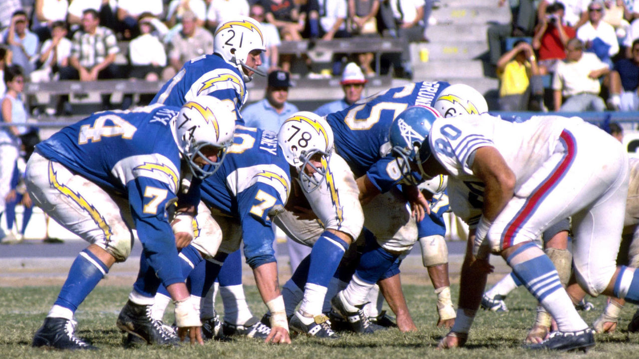
The Chargers’ uniforms have been tweaked and redesigned many times over the years, rarely producing an unappealing result. Many fans are often torn between the royal blue helmets and yellow pants of the 1970s, the navy blue base and white lightning bolts of the 1990s, or the navy and powder blue combo sported by the team until last month’s redesign that aimed to combine all the eras. But for us, and it’s fair to say for most others, the Chargers have never looked better than they did in the mid-1960s. Lightning bolts as stripes might be a little hokey if they weren’t so damn cool.
8. Chicago Blackhawks (current)
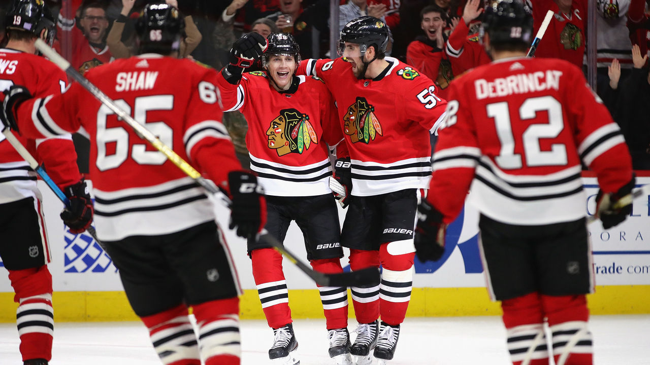
Thanks to three Stanley Cups from 2010 to 2015, the Blackhawks’ timeless style – which more or less has been the same since 1955 – regained clout. Chicago lost its place among hockey’s top franchises thanks to shoddy ownership before its resurgence last decade. However, the club has always looked great on the ice through it all. The vibrant home red jersey, complemented by matching double stripes at the elbow, waist, and socks, has long been one of the best in hockey. Factor in the beautifully colorful crests on the front and shoulders, and the Blackhawks’ everlasting aesthetic is undeniably great.
7. San Francisco 49ers (current)
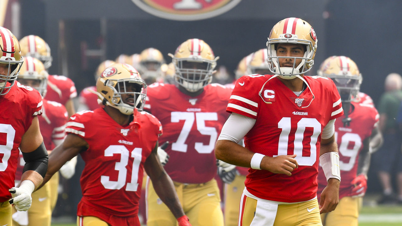
Joe Montana made the 49ers’ persona famous as he dominated the 1980s, and after an experiment with black accent colors – a trap they certainly weren’t the only to fall into – for the decade-plus that followed, San Francisco’s look is back as it belongs. A simple red jersey is brought to life with gold helmets and pants, consistent striping patterns, and the aura of an unforgettable dynasty that produced some of football’s most famous moments. When the Niners rock their reds under the Bay Area sun, they practically glow.
6. Notre Dame (current)
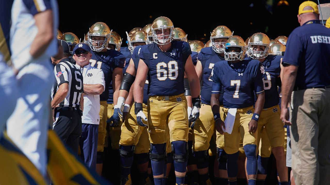
There are no neutral feelings toward Notre Dame. The Fighting Irish have one of the largest and most loyal followings in America, but if you don’t fall on the supporters’ side, there’s a good chance you despise everything about their football program. Love them or hate them, we can all agree Notre Dame looks good. Navy and gold – 24-karat gold, in fact, for the fabled blank helmets – is all Notre Dame needs to deliver the best look in college football.
5. Los Angeles Lakers (1980s)
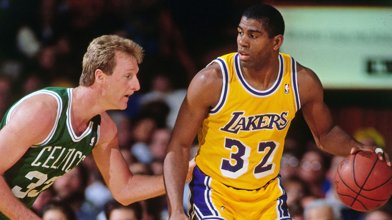
The Lakers not only won five championships in the 1980s, but they also created the NBA’s most recognizable and globally popular uniform. The digs worn by Magic Johnson and Co. are the quintessential Los Angeles design, featuring a famous drop shadow on the purple numbers the club moved away from during the Kobe Bryant era, which coincidentally yielded five titles, as well. But when LeBron James came to town, L.A. brought back its old look, but today’s jersey sponsorships and other minor details don’t quite match the lore that surrounds the “Showtime” Lakers.
4. North Carolina basketball (1990s)
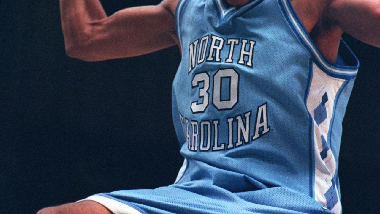
The Tar Heels’ “Carolina blue” has always looked amazing, but legendary head coach Dean Smith wanted something new in the 1991-92 season, and designer Alexander Julian introduced the world to the argyle pattern still used and revered in 2020. There have been several gorgeous renditions since, but UNC’s original redesign – also accompanied by a bigger, bolder wordmark and more detailed trim than on today’s uniforms – gets the nod for the best look the storied university has ever used.
3. New York Yankees (current)
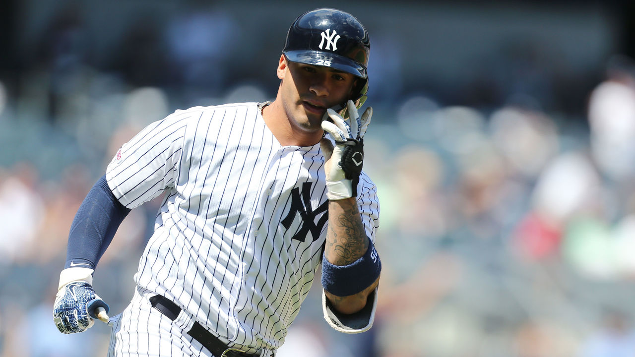
There aren’t many elements to these uniforms, but every single one of them – the pinstripes, the interlocked “NY” on the cap and over the heart, and the absence of player names on the back – is iconic. Would these rank so high if the Yankees achieved a similar level of success as the Detroit Tigers (another team with a simple and timeless uniform) and not won 27 World Series titles? It’s impossible to say, as you can’t separate the memories of all the Bronx Bombers legends who’ve worn this uniform over the last century from the design itself. Pinstripes have become, and will always be, synonymous with greatness.
2. Montreal Canadiens (current)
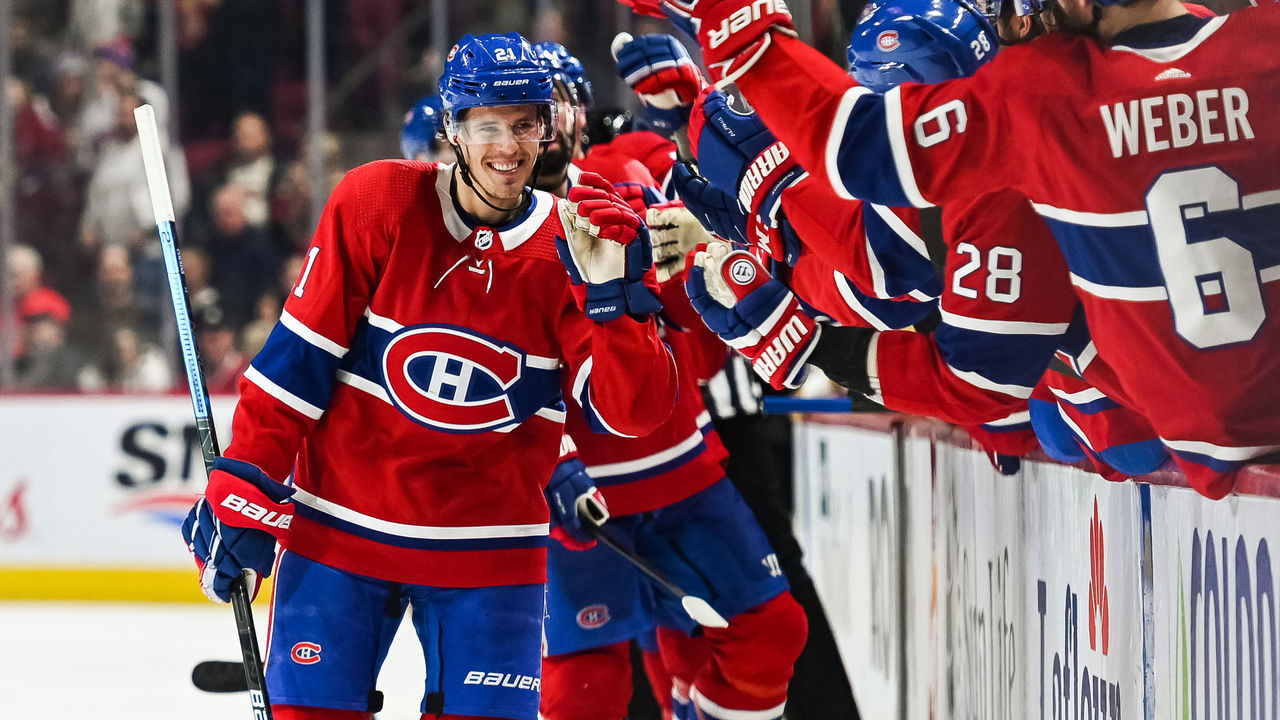
The most untouchable uniform in all of hockey. The Canadiens’ classic red sweater has been almost exactly the same since the dawn of the NHL in 1917, and its signature touch is the blue stripe around the middle, creating the perfect backdrop for a logo that’s also undergone minimal changes for more than a century. Montreal’s uniform scheme is so iconic that the club has opted to make use of a third jersey only once, and while the Habs’ look has slightly modernized over time, aspects of their historic getups – namely, the white collars and laces – have rightfully lived on. There’s simply no team that does tradition like the Canadiens.
1. Las Vegas Raiders (current)
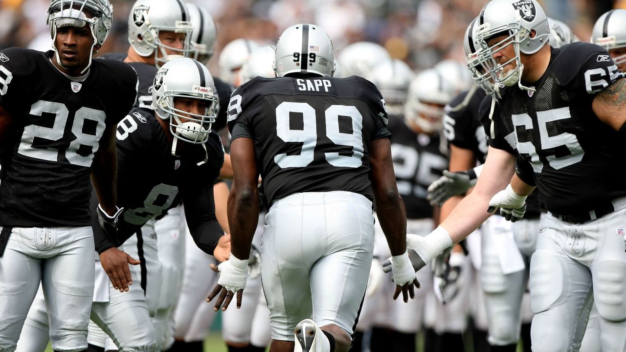
The Raiders have made plenty of mistakes on and off the field over their history in Oakland, Los Angeles, Oakland again, and now Las Vegas. But one thing they got exactly right was their uniforms. The black and silver debuted in 1963 – following a three-year stint during which the team used gold instead of silver – and hasn’t been touched since. Players put on these uniforms and instantly take on a menacing villain aura, which is exactly the mindset you want when brute force and physical dominance are paramount. Nothing has ever given a team more street cred than when rap group N.W.A. made Raiders gear a staple of their early-90s fashion. Since then, it seems as though half the teams in professional sports have introduced a black alternate jersey. And they were all, to some extent, trying to emulate the Raiders.

